|
|


As it becomes easier and easier to pass things and information around the planet at lightning speed, we find that our social and work lives are increasingly globalized. Our friends, families, workmates and clients are spread out all over the planet. We want to schedule net meetings and phone calls with them, we want to meet online to chat or play games, and there's something getting in the way a lot more often than it used to:
Time zones.
It's hard to keep track of how many hours the time gap is between where you're standing and where your overseas distributor is located, whether you're speaking in terms of your local time or theirs, and whether to add or subtract the difference when figuring out what your watch should say when you make the call. It's worse if either or both of you happen to be traveling, which is increasingly the case now that we all have cell phones, and the fact that there's also Daylight Saving Time which starts and ends on different days in different countries makes things enormously complicated. Some of us waste a lot of time trying to clarify these details (and then we screw it up anyway).
Wouldn't it be nice, and much simpler, if we could all agree on what time it was, all over the world? At first I thought we should just use unaltered Greenwich Mean Time for everything and call it a day. I'd be all right with that, frankly. Computers do it. The only problem is that we've all become accustomed to having certain numbers line up with certain parts of the day, and having the clock "roll over" in the middle of the night (and also at mid-day if you're using the 12-hour system). To move the numbers feels peculiar, and to change them more for some people than for others feels unfair.
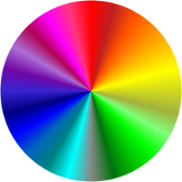
This is an inherent problem with any time marking system that uses numbers, or letters, or anything else where there is a hierarchy and a point where you return to the beginning. What would be better is a time marking system that forms a natural loop without feeling like it has any particular beginning or end, and without us having habitual expectations about which part of the cycle lines up with which part of the day. That's where the color wheel comes in.
We can simply decide that at some particular point, the time is "orange," everywhere on the planet. Later on it will be yellow, green, teal, blue, maroon, and so on, and eventually orange again. In my part of the world, people tend to wake up in the blue range, eat lunch around lavender and get off work at orange, but elsewhere it may be that you wake up at yellow and have dinner at purple. Neither seems to make more sense than the other, which is exactly the point. And then if we want to have a phone call, we can arrange to speak at thirty minutes past indigo, and there is no confusion about exactly when that means.
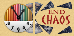
And so I decided to implement this clock, as an arbitrary standard for coordinating time around the globe.
I tried varying the saturation of colors in addition to the hue to get a little more variety. It helped, but was still not enough. I tried schemes based on HSV instead of RGB, but ultimately no simple function was satisfactory. The fact that the human eye can detect more subtle variations in color in different parts of the spectrum proved problematic.
What you see here is not a simple algorithmic function, instead, it is hand-crafted to try to get an effective spread of viewable colors around the dial. It is neither perfect nor optimal - nor can it be, since the ability to discern color differences varies between individual humans - but it's not bad.
This is still a bit of a beta version... comments welcome!
Love on International Color Time
I saw you first at half maroon
We talked til peach obscured the moon
Now here it is banana hue
And every tint I think of you
Meet me by the old caboose
At seven shades beyond chartreuse
Just before the neon lime
Bring a brush and we can paint the time